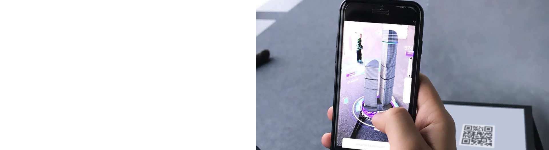
Tips for Creating Scan-Ready AR QR Codes
To create a QR code for a link, video or picture - click on the button below.
Article Plan
- Why QR Code Quality Matters for AR Experiences
- Essential Design Elements for Scan-Ready QR Codes
- Error Correction Levels and Branding
- Strategic QR Code Placement
- Technical Optimization for Mobile Scanning
- Creating Branded AR QR Codes
- Mobile Experience Optimization
-
Frequently Asked Questions about Scan-Ready AR QR Codes
- Can I use colors other than black and white?
- How large should the quiet zone be?
- What’s the best error correction level for branded codes?
- How do I know if my QR code is too dense?
- Should I test QR codes before deployment?
- What file format should I use for printing?
- Can scanning distance affect QR code effectiveness?
- What happens if I place a logo over critical code sections?
Why QR Code Quality Matters for AR Experiences
Creating scan-ready AR QR codes requires balancing technical functionality with user experience. A poor-quality QR code frustrates users before they even access your AR experience. High-contrast design, proper sizing, strategic placement, and mobile optimization directly impact scan success rates. Best practices ensure codes remain scannable across different devices, lighting conditions, and distances.
Essential Design Elements for Scan-Ready QR Codes

Size and Readability Standards
Minimum Size: 1 x 1 inch (2.5 x 2.5 cm) for close-range scanning (0.5–1 meter). Scale larger for increased scanning distance: billboards require 2+ meters width for reading from 20 meters away.
General Rule: Size should increase proportionally with viewing distance. For every meter of scanning distance, add 1 cm to QR code width.
Digital Displays: Minimum 180–240 pixels wide on 1080p screens; scale to 360–480 pixels on 4K displays.
Print Format: Always use vector formats (SVG, PDF, EPS) to prevent pixelation when scaling. High-resolution PNG (300 DPI minimum) works as backup but vector ensures crisp output at any size.
Color Contrast Requirements
Dark Foreground on Light Background: Black on white remains the gold standard for reliability. Contrast ratio must exceed 3:1 for accessibility compliance.
Accepted Color Combinations:
- Dark blue on white
- Black on light gray
- Dark green on cream
- Dark purple on light yellow
Avoid Inverted Designs: Never use light codes on dark backgrounds. Smartphone cameras struggle with light dots on dark backgrounds and often fail to recognize inverted QR codes.
Multicolor Caution: Avoid rainbow or heavily colorized designs. They reduce contrast between adjacent elements and make codes harder for cameras to parse. Stick to 2–3 colors maximum: primary color for modules, secondary for corner elements, neutral light background.
The Critical “Quiet Zone”
The quiet zone—white space surrounding a QR code—is essential for scanner recognition.
Minimum Requirement: At least 4 times the width of one small black module (approximately 15% of total QR code size).
Common Mistake: Placing codes too close to text, images, or colored backgrounds without clear separation causes scanners to misidentify code boundaries and fail.
Best Practice: Include the quiet zone as part of code design itself. If using non-white backgrounds, make the quiet zone match the background color for uniform appearance.
Error Correction Levels and Branding
QR codes include built-in error correction enabling scanning even when partially damaged or obscured.
| Level | Error Tolerance | Logo Safety | Best For |
|
L (Low)
|
7% damage |
Not recommended
|
Simple unbranded codes
|
|
M (Medium)
|
15% damage
|
≤10% logo size
|
Standard marketing
|
|
Q (Quartile) |
25% damage
|
10–15% logo size
|
Branded codes with small logos
|
|
H (High)
|
30% damage
|
Up to 30% logo size
|
Heavily customized designs
|
Logo Placement Rules:
- Maximum coverage: 30% of total code area
- Position: Center only
- Shape: Circular or square logos work best
- Background: Solid white or light background behind logo
Always use Q or H-level error correction when adding logos or custom branding. Never exceed logo size limits—doing so compromises scan reliability.
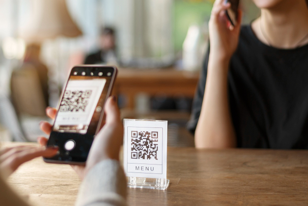
Strategic QR Code Placement
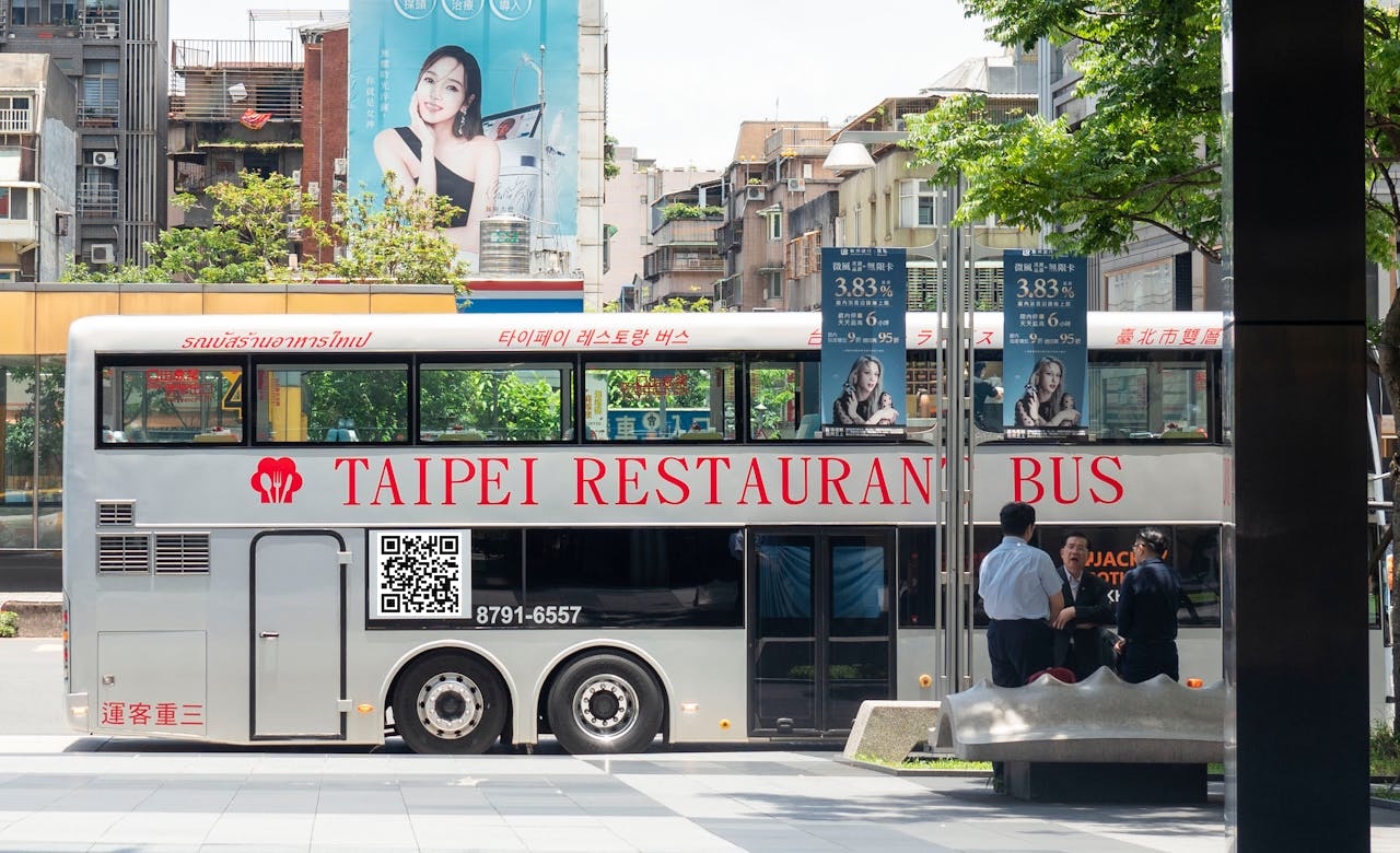
High-Traffic Locations
Place codes where people naturally look and pause: eye level, front-facing, and accessible without bending or straining. High foot-traffic areas (malls, parks, transit stations) maximize exposure.
Decision-Making Points: Position codes where purchase intent peaks (product shelf, checkout counter, sign-up area). This converts curiosity into action.
Environmental Considerations
Lighting: Well-lit areas significantly improve scan rates. Avoid harsh shadows, glare, or backlighting. Indoor placement requires consistent brightness; use digital screens for even illumination.
Surface Type: Flat, unobstructed surfaces prevent distortion. QR codes on curved or textured surfaces become unreadable. Ideal: posters, banners, product packaging smooth areas, digital displays.
Weather Protection: Outdoor codes require laminated prints, weather-resistant stickers, or UV-protected materials. Test codes before deployment to ensure clarity persists over time.
Distance-to-Size Formula
Calculate proper QR code size based on expected scanning distance:
Scanning Distance / 10 = Minimum QR Code Width (cm)
Example: If users scan from 2 meters away, minimum QR width = 2m ÷ 10 = 20 cm.
Billboard placement (20m+ distance) requires 2+ meter wide codes for reliable scanning.
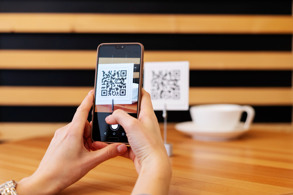
Technical Optimization for Mobile Scanning
Resolution and File Format
Generate QR codes in vector format (SVG, EPS, PDF) for all print materials. Vector files scale perfectly without pixelation or quality loss. For digital use, PNG at 300 DPI minimum ensures clarity.
Testing Across Devices
Scan codes using multiple device types: iPhone vs Android, newer vs older models, different scanner apps. Test from various distances (0.5m, 1m, 2m), angles (straight-on, 45-degree), and lighting conditions (bright, dim, outdoor sunlight).
Test Protocol:
- Scan at minimum intended distance
- Scan at maximum intended distance
- Test in poor lighting conditions
- Test on at least 3 different phone models
- Have non-technical users test for usability
URL Shortening
Shorten destination URLs to reduce data density in QR codes. Shorter URLs encode faster, scan more reliably, and load quicker post-scan. Dense QR codes require larger sizes for reliable scanning.
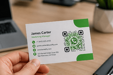
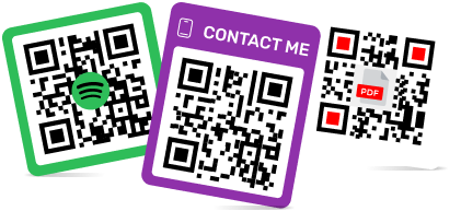
Creating Branded AR QR Codes
Customization Without Compromising Scannability
Branded QR codes increase trust but require careful design:
- Logo Integration: Use circular or square logos in the center. Maintain solid white background behind logos. Ensure logo contrast against code background.
- Frame Addition: Add branded frames with company colors or CTA text around the quiet zone. Keeps design integrated without disrupting scanning.
Frame Best Practices:
- Matches brand colors
- Contains clear CTA (e.g., “Scan for AR experience”)
- Uses readable fonts (14px+ size)
- Maintains adequate contrast
Error Correction Adjustment
Always use Q or H-level error correction when branding QR codes. This provides data redundancy preventing scan failure if logo placement or design elements accidentally overlap with critical code sections.
Mobile Experience Optimization
Creating scan-ready QR codes includes optimizing what happens after scanning.
Post-Scan Experience:
- Mobile-first design: Responsive layout, thumb-friendly buttons
- Fast loading: Target under 3 seconds; compress images to <100KB
- Clear CTA: Single primary action; avoid multiple steps
- Minimize redirects: Direct links perform better than redirect chains
- Accessible forms: Pre-fill when possible; reduce required fields
Poor post-scan experience wastes design effort. A beautifully designed, perfectly placed QR code fails if it leads to slow-loading or confusing pages.
Frequently Asked Questions about Scan-Ready AR QR Codes
Minimum 4 times the width of one small black module—approximately 15% of total QR code size. Larger is safer. Always include clear border on all four sides.
Use Q or H level (25–30% error tolerance). Q suits codes with small logos; H handles heavily customized designs. Never use L or M with logos.
Codes with intricate patterns or unusual module shapes become dense and harder to scan from distance or in poor lighting. Keep design clean; test scanning from your maximum intended distance.
The code may fail. Use H-level error correction (30% tolerance) when adding logos. Keep logos ≤30% of code area and centered only.